10 Years of Experience in web design solutions
Build. Rank. Grow.
Web Development, SEO & Digital Marketing Agency in Lahore, Pakistan
Ozairwebs builds fast, SEO-friendly websites, ecommerce stores, web applications, branding assets and digital growth campaigns for startups, small businesses and service-based companies.
10+Years Experience
358+Client Satisfactions
365+Projects Completed
Loading…
We build digital experiences that convert.

Web development
High-performance, AI-integrated, and mobile-first websites development using modern frameworks & CMS to ensure fast loading.

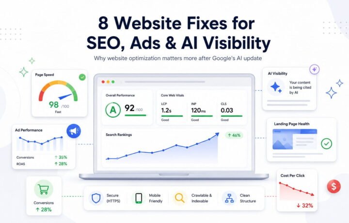
AI-driven SEO and multi-channel marketing to maximize your brand’s online visibility, search rankings, and user conversions.

Web Apps & Tools
We Designs and develops interactive, custom-coded web tools; ranging from simple health calculators to complex engineerings web base tools.

Banding and social media
Builds powerful brand identities and high-conversion social media strategies, using data-driven visuals and AI-optimized content.

E-Commerce Solutions
Custom Shopify & WordPress Development, shopping cart, custom product page design, & secure payment gateway integration.

AI Solutions & Automation
Custom AI chatbots, intelligent automation, AI-powered tools, and business solutions designed to streamline operations, & improve customer experience.
Ozairwebs specializes in web design, custom software, mobile app development, and SEO, helping businesses turn online visibility into real outcomes. As a Pakistan based web design and website development company, we build solutions that are practical, secure, and made to support growth, whether the goal is more leads, better conversions, or stronger customer trust. Ozairwebs supports brands with elegant websites, scalable applications, clear branding, and results focused online marketing that matches how real people search and decide. With more than 100 websites delivered, we have worked with clients across retail, services, real estate, finance, fashion, media, and tourism, bringing the same approach every time, strong strategy, clean execution, and a final product that is easy to manage and built to perform.
Featured Websites Designed by Ozairwebs
These are featured websites designed by Ozairwebs. We have also designed and developed many more websites for different businesses, and you can view the complete collection on our main portfolio page.

- E-commerce
- Organic Food Store
Sadapure
Sadapure.com is a Pakistan-based food brand focused on multigrain flours, seeds, and wellness-oriented pantry products. The website highlights blends made from whole grains, pulses, and seeds for everyday family use and better nutrition. Sadapure also provides online shopping, customer support, and contact options for orders and inquiries in Pakistan.


- Assignment
- Education Website
ReadEssay
ReadEssay.com is an academic assistance website that offers services like assignment help, homework help, online class support, and exam-related assistance for students. ReadEssay presents itself as a global online support platform with contact options, pricing information, and customer support access.

- Shopify
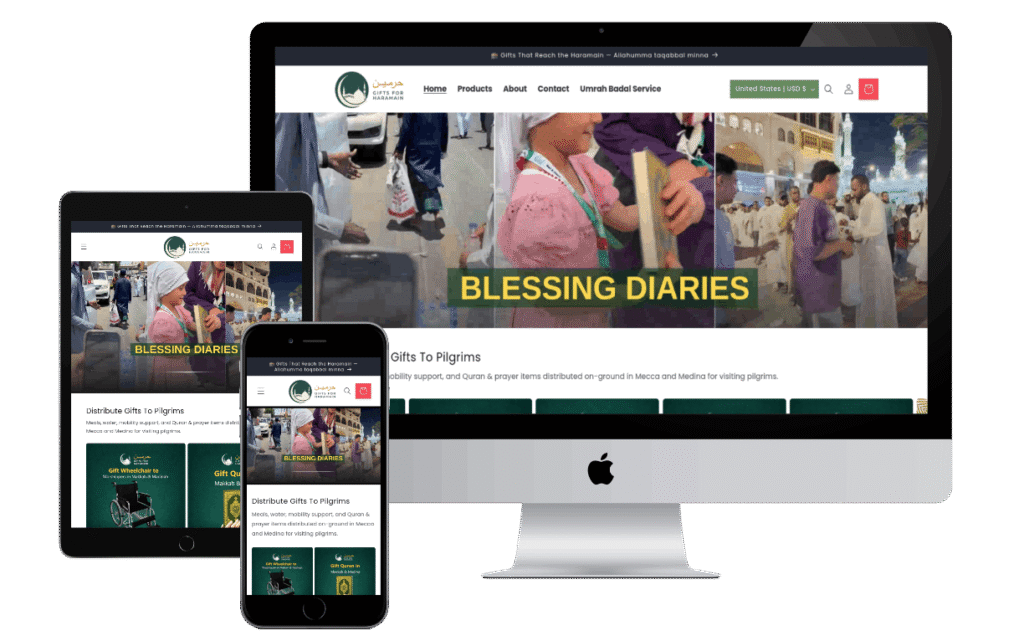
- Harmain Gifts
GiftsForHarmain
Designed and developed Gifts for Haramain as a focused ecommerce Shopify website for a spiritually meaningful product niche. Created a clean and trustworthy digital experience that makes browsing, product discovery, and purchasing feel simple and clear. Shaped the site to reflect the brand with a polished layout, smooth user journey, and conversion focused structure. Built by Ozair Webs to combine strong presentation, usability, and business driven web design.
What You Get With Ozairwebs
We Think
Strategy & Advisory
30+
Incredible Clients
100+
Projects Delivered
8+
Years of Experience
We Make
Creative & Design
We Build
Software & Websites
We Shape
Creative & Branding
We Support
Scale & Optimize
Pricing Plans for Web Development and Growth
Choose a plan that matches your website scope and business needs. Each package includes design, development, and essential SEO setup, with clear deliverables, defined page limits, and upgrade options as your requirements expand.
Pricing plans built for growth with clear deliverables measurable KPIs and a clean conversion focused delivery process
Starter
Starter$499
one-time
$2388/yr
$1791/yr
Growth
Recommended$999
one-time
$4188/yr
$3141/yr
Pro
Scale Plan$1999
one-time
$7188/yr
$5391/yr
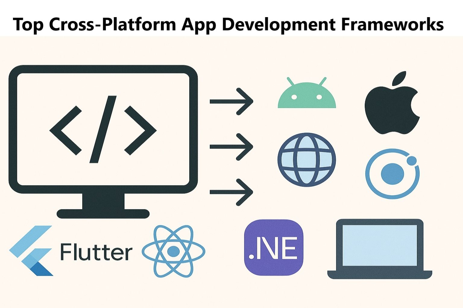
Tools We Use for Your Project
We build and manage websites using trusted tools like WordPress, Shopify, Wix, HubSpot, Analytics, Google Ads, SEMrush, Figma, React Native, Microsoft services, and Ionic. These platforms help us deliver a website that is fast, secure, easy to update, and ready for SEO, tracking, and marketing from day one.


Platforms We Specialize In

WordPress

Laravel

ReactJS

WooCommerce

HubSpot CRM

Shopify
Insights for businesses that want predictable online growth

Female Content Writing Jobs: OZAIRWEBS
Top Cross-Platform App Development Frameworks
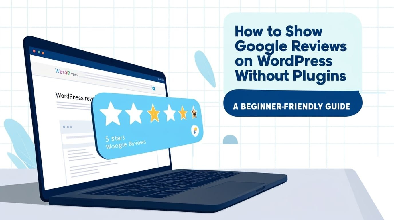
How to Show Google Reviews on WordPress Without Plugins 2025: A Beginner-Friendly Guide
Loading…
Share Your Requirements and Get a Plan, & Quote
We will reply with the recommended approach, a clear delivery timeline, and a transparent quote based on your message. From first message to final handover, you get direct communication, and full ownership of your website and files.
1005311
HOURS WORKED SINCE 2017
62829
LINES OF CUSTOM CODES
200
PROJECTS COMPLETED
710
CLIENTS SERVED ACROSS WORLD
1
YEARS OF EXPERIENCE

Frequently Asked Questions
SEO & AI Search
Rank, speed, indexing, structured data, and search intent coverage.
+How do you improve rankings without triggering spam signals?
We improve rankings by building pages that genuinely answer what people search for, using clear structure, real proof, and natural language. We strengthen internal linking and topical coverage so search engines understand your services and your expertise. We avoid thin pages, duplicated templates, and over-optimized patterns that can look manipulative. The focus stays on useful content and clean technical SEO so growth remains stable through algorithm changes.+Do you optimize Core Web Vitals, including interaction responsiveness?
Yes. We optimize Core Web Vitals by improving real load speed, interaction delay, and layout stability across key pages. That includes compressing and properly sizing images, reducing unused scripts, and deferring heavy third-party tags where possible. We also fix layout shifts by reserving space for media and stabilizing fonts and UI components. You get measurable before and after improvements, not just a temporary score boost.+What is your approach to topical authority and content architecture?
We map your services into a clear site architecture that matches buyer intent, including discovery, comparison, and decision-stage queries. We build supporting pages and FAQs around each core service so search engines and users can quickly understand depth and relevance. Internal links are planned to guide visitors to the next best page and to strengthen your most important URLs. This approach improves rankings and helps your content convert, not just attract clicks.+Do you implement structured data and keep it compliant?
Yes. We add structured data only when it matches what is visible on the page and accurately reflects your business information. Markup is kept consistent across pages, validated for errors, and updated when site content changes. We avoid exaggerated claims and misleading schema types that can cause manual actions or rich result loss. The goal is eligibility and trust, not shortcuts.+How do you handle indexing, crawl issues, and duplicate pages?
We fix indexing issues by cleaning up sitemaps, canonical tags, redirects, and noindex rules so search engines focus on the pages that matter. Duplicate URLs, parameters, and thin archive pages are controlled to protect crawl budget and reduce index bloat. We also repair internal linking issues so important pages are easier to discover and recrawl. This produces cleaner visibility and more predictable rankings.+How long does SEO take to show results, and what will you report?
Early movement can appear within weeks, but meaningful growth usually builds over multiple months depending on competition and your starting point. We report what matters: organic visibility, qualified traffic, conversions, and the specific fixes or content changes that drove progress. You also receive a clear priority list of next actions so there is always a reason behind the work. Reporting stays practical and decision-focused, not filled with vanity metrics.+Do you help with local SEO like Google Business Profile and service areas?
Yes. We optimize your Google Business Profile details, categories, services, and trust signals to improve visibility in local results. If location pages are needed, we create them with real value and unique context instead of spammy duplicates. We also help with NAP consistency, citations, and review strategy where appropriate. This improves calls and inquiries from nearby searches.+What does “AI Search” optimization mean for my business pages?
It means structuring your pages so the information is easy to understand, easy to verify, and easy to reference across modern search experiences. We improve clarity around your services, outcomes, process, and proof, and we add supporting FAQs where they help users decide. We strengthen entity signals like business name, service areas, and expertise, and connect pages with purposeful internal linking. The result is better visibility and stronger trust when people discover your brand through search.
+How do you decide the best platform for my project?
We recommend the platform based on your goals, content workflow, required features, and how you plan to grow. We also consider SEO control, performance, security, and how easy it will be for your team to manage updates. If your project needs simple marketing pages, we prioritize speed and clean editing. If your requirements are advanced, we propose a structure that stays stable and maintainable as complexity increases.+How do you ensure the website converts visitors into leads?
We build a clear path from first impression to action by tightening messaging, reducing distractions, and placing CTAs where visitors naturally make decisions. Forms are kept short, mobile-friendly, and protected from spam so you receive real inquiries. Trust signals like reviews, process, and guarantees are placed near conversion points instead of being hidden. After launch, we use analytics and behavior signals to improve what matters most.+Do you build with accessibility and modern UX standards?
Yes. We follow practical accessibility standards, including semantic structure, keyboard navigation, readable contrast, proper labels, and responsive typography. This improves usability for everyone and reduces friction on key pages like services and contact. Good UX also supports SEO and conversion performance because users can find information faster. You get a site that feels professional and easy to use across devices.+How do you keep performance strong as the site grows?
We build with reusable components and avoid unnecessary heavy add-ons that slow the site over time. Images follow sizing rules, scripts are organized, and new sections are created using a consistent system. We also keep an eye on performance budgets so new pages do not quietly increase load time. This allows you to scale content and features without sacrificing speed.+How do revisions and delivery milestones work?
We deliver in clear stages so you can approve direction before the next step begins. Typical checkpoints include structure, design, development, QA, and launch preparation. Feedback is collected in organized rounds to keep decisions clean and to prevent endless back-and-forth. This keeps timelines predictable and ensures you always know what is in progress.+What do you need from me to start the website project?
We usually need your services list, target market, examples you like, and any brand assets such as logo and colors. We also confirm your main conversion goal, for example calls, WhatsApp, forms, bookings, or purchases. If you do not have content ready, we provide content structure guidance so pages still feel clear and complete. This keeps the project moving and reduces rework later.+Can you migrate my existing website without losing SEO or content?
Yes. We migrate with a plan that protects URLs, metadata, and key content structure wherever possible. Redirects are mapped carefully, and we test the site on staging before switching the live version. After launch, we verify Search Console, sitemaps, and crawl health to catch issues early. This minimizes traffic loss and preserves search visibility.+Will my website be easy for my team to update after delivery?
Yes. We set up pages with reusable sections and an editing experience that avoids layout-breaking mistakes. We provide simple guidance for updating text, images, and new pages while keeping the design consistent. If needed, we add guardrails like global styles and locked components. Your team can update confidently without needing a developer for every small change.
+How do you optimize product pages for higher conversions?
We improve product pages by making value and key details easy to understand within seconds, especially on mobile. Media is upgraded, benefits are written clearly, and size, delivery, and returns info is placed near the buy decision. We also place trust elements like reviews and guarantees where they reduce doubt. The result is better add-to-cart performance and fewer abandoned sessions.+Can you set up advanced variants, SKUs, and inventory workflows?
Yes. We configure variants, SKUs, bundles, and inventory rules so your catalog stays organized and easy to manage. We also improve admin workflows for pricing, stock updates, and product publishing to reduce errors. If your products have many options, we refine selection UI and filtering for customers. This saves time for your team and improves the buying experience.+Do you optimize checkout speed and payment success rates?
Yes. We reduce checkout friction by simplifying form fields, clarifying delivery expectations, and removing distractions that cause drop-offs. Payment options are configured cleanly and tested to avoid failed transactions and confusion. We also reduce heavy scripts on checkout pages to keep them fast. This improves completion rate and increases revenue consistency.+Can you implement upsells, cross-sells, and cart recovery?
Yes. We implement upsells and cross-sells in a way that fits your brand and does not feel pushy. Cart recovery flows are set with the right timing, clear messaging, and segmentation so customers are not spammed. We also recommend bundles and offers that improve average order value. This increases revenue without hurting trust.+How do you handle shipping rules, taxes, and automation?
We configure shipping zones, delivery options, thresholds, and handling rules so customers see clear expectations before they pay. Taxes are set based on your store setup and target regions. We automate order emails, notifications, and operational updates so customers stay informed. This reduces support questions and improves post-purchase satisfaction.+Which e-commerce platform is best: Shopify, WooCommerce, or custom?
We recommend the platform based on catalog size, flexibility needs, payment requirements, and long-term maintenance cost. Shopify is often the fastest and most stable for many stores, while WooCommerce is a strong option when you need WordPress flexibility. Custom development is best when requirements are unique and app-based solutions cannot support growth. The decision is based on ROI, not preferences.+Can you set up COD, bank transfer, and local payment gateways?
Yes. We set up Cash on Delivery and manual payment methods, and we integrate supported local gateways depending on your platform and region. Checkout messaging is adjusted to reduce failed deliveries and misunderstandings. For higher-risk orders, we can add verification steps where appropriate. The goal is fewer cancellations and more successful payments.+How do you reduce returns and improve customer satisfaction?
We reduce returns by improving clarity upfront through accurate product details, sizing, policies, FAQs, and better imagery. Delivery expectations and support options are made easy to find so customers feel confident. We also improve order emails and tracking communication to reduce uncertainty. Clear information leads to fewer surprises and better reviews.
+Do you optimize real-user speed, not just lab scores?
Yes. We optimize the experience users feel, focusing on fast initial rendering, stable layout, and responsive interactions. Lab scores matter, but we validate improvements on real pages and real devices to confirm impact. We prioritize changes that reduce bounce and improve conversions, not just numbers. Your site becomes genuinely faster for visitors.+How do you reduce plugin and third-party script bloat?
We audit plugins and scripts, remove duplicates, and replace heavy tools with lighter alternatives when possible. Non-critical scripts are delayed, and widgets are loaded only on pages where they are needed. We also clean tracking setups that often become messy over time. This protects important pages like landing pages and checkout from slowdown.+Can you implement caching properly without breaking dynamic features?
Yes. We configure caching rules carefully so dynamic areas like carts, logged-in views, and forms remain accurate. Asset versioning and cache headers are set to prevent outdated files from sticking around. If a CDN is used, we configure it to match the website behavior. You get speed improvements without unexpected functional issues.+Do you handle image optimization at scale?
Yes. We implement practical image standards, including correct sizing, compression, and modern formats where supported. Lazy loading is configured in a way that improves speed without harming usability. We also provide upload guidelines so future images do not silently slow the site. This keeps the website fast even as your content library grows.+How do you prevent layout shifts and visual instability?
We prevent layout shifts by reserving space for images and embeds, stabilizing fonts, and avoiding late UI injections. We also review banners, popups, and third-party tools that often cause sudden reflows. CSS and layout rules are structured to keep pages visually steady. This creates a calm experience that feels premium and trustworthy.+Will performance changes affect my design or website features?
We protect design and functionality while optimizing speed by changing how assets load, not by removing important features blindly. If a feature is heavy, we improve its loading strategy, compress assets, or replace it with a lighter implementation. When trade-offs exist, we explain impact and options before changes are made. You keep control over priorities while gaining performance.+Do you optimize for mobile networks and low-end devices?
Yes. We reduce page weight, improve rendering order, and remove unnecessary resources that slow mobile users. Touch interactions are tuned, and images are correctly sized for smaller screens. We test key pages under realistic mobile conditions to confirm improvements. This is important because a large share of leads and purchases come from mobile.+Can you fix slow WordPress themes or page builders without a rebuild?
In many cases, yes. We identify the actual bottlenecks such as heavy widgets, oversized media, and duplicated scripts, then optimize strategically. Caching, asset cleanup, and layout restructuring often produce strong gains without a full rebuild. If a rebuild is truly the best option, we explain why with clear evidence and alternatives.
+What security baseline do you apply for modern websites?
We apply a practical security baseline that includes hardened admin access, least-privilege roles, and protection of common entry points. Core software, themes, and dependencies are updated using safe procedures to avoid breaking the site. We also configure server and application-level protections where your hosting supports them. The goal is reduced risk with minimal friction for your team.+Do you protect against brute force and automated login attacks?
Yes. We use rate limiting, stronger authentication, bot protection, and login hardening to stop automated attacks early. Suspicious behavior is monitored and alerts can be configured so issues are visible quickly. We also reduce weak password exposure by enforcing better access rules. This significantly lowers account takeover risk.+How do you reduce risk from vulnerable plugins and components?
We reduce risk by keeping the plugin and dependency list lean, choosing reputable components, and removing tools that duplicate features. Updates are tested on staging when possible to reduce live-site breakage. We also monitor known vulnerabilities and patch quickly when an issue is identified. Less bloat typically means fewer attack surfaces.+Can you help if the website is hacked?
Yes. We investigate the entry point, clean malicious files, and remove hidden backdoors so the infection does not return. Credentials are rotated, vulnerabilities are patched, and security rules are strengthened. If a clean restore is needed, we validate backups and restore safely with checks afterward. The focus is full recovery plus prevention, not just a quick cleanup.+Do you implement secure headers and cookie policies?
Yes. We configure security headers and session protections that reduce common threats while keeping the site functional. Cookie policies and consent requirements can be aligned with how your site actually uses analytics and marketing tools. We avoid overly strict settings that break tracking or essential features. Security is implemented thoughtfully so it supports usability and compliance.+Do you include backups and a rollback plan for security changes?
Yes. We take verified backups before major updates or security changes and confirm that restore methods work. Changes are applied in controlled steps so we can roll back safely if something conflicts. This protects you from unexpected downtime and reduces risk during upgrades. It is a professional safeguard that keeps your business stable.+How do you protect contact forms from spam and fake leads?
We combine multiple layers such as validation, rate limiting, anti-bot checks, and smart filtering to reduce spam. Forms are structured to discourage automated submissions and to capture high-quality lead details. Where needed, we add server-side checks and honeypots to block bots silently. This keeps your inbox clean and improves lead quality.+Will security hardening affect site speed or SEO?
When implemented properly, security hardening should not harm speed or SEO and often improves stability. We use lightweight protections and configure them to avoid blocking legitimate search crawlers or users. If a security layer could add latency, we optimize its configuration or suggest alternatives. The goal is safety without performance compromise.
+What does monthly maintenance cover in practical terms?
Monthly maintenance covers updates, compatibility checks, backups, monitoring, and priority fixes that keep your website stable and secure. We also run regular security scans and performance checks to catch problems early. Depending on your plan, small improvements and content updates can be included. The outcome is fewer surprises, less downtime, and consistent site quality over time.+How do you apply updates without breaking the live website?
We follow a safe update workflow that includes backups before changes, testing on staging when possible, and QA of key flows like forms, checkout, and navigation. If a conflict appears, we roll back safely and fix the root issue before retrying. Updates are scheduled to reduce business impact. This keeps improvements steady without unstable surprises.+Do you support ongoing content publishing and landing page iterations?
Yes. We can publish new pages, improve existing content, adjust CTAs, and refine layouts to support campaigns and better conversions. New content is checked for SEO structure and performance impact so growth does not slow the site. We also track what changed so it is easy to review and improve further. This helps your website stay active, competitive, and relevant.+How do you handle urgent issues and downtime?
We prioritize restoration first by isolating the cause and applying a safe hotfix to bring the site back online. Then we implement a permanent fix and prevention steps to avoid repeat incidents. Monitoring, logs, and backups help speed up recovery and reduce guesswork. The goal is minimal business impact and reliable stability after the incident.+Can you keep design consistency as the website grows?
Yes. We maintain a consistent design system using reusable components, spacing rules, and typography standards. New pages and sections are built using the same structure so the website stays visually unified. If multiple team members edit content, we add guardrails that prevent design drift. This keeps your brand presentation premium and consistent over time.+Do you offer content updates like pricing, service changes, and new sections?
Yes. Routine updates like pricing edits, service changes, and new sections are typically part of maintenance support depending on the plan. We ensure every change remains responsive, on-brand, and performance-safe. For larger work such as a new landing page or campaign build, we scope it clearly before starting. You get fast updates without messy side effects.+How do you communicate tasks and progress during maintenance?
We keep communication simple and accountable by sharing what was completed, what is next, and what risks were discovered. Requests follow a clear workflow so nothing gets lost or delayed. Updates are written in plain language so you can understand progress quickly. This makes ongoing support transparent and easy to manage.+Can you take over maintenance for a website built by someone else?
Yes. We begin with a quick audit of hosting, theme, plugins, performance, and security risks. Then we stabilize backups, apply security baseline protections, and resolve urgent issues before making improvements. If the stack is outdated or risky, we recommend the safest upgrade path with clear reasoning. This makes takeover smooth and reduces the chance of unexpected failures.
+Can you connect forms to CRM and automate lead routing?
Yes. We connect your forms to your CRM so leads automatically enter the right pipeline, team, or region. We can also configure instant notifications through email or other tools based on your workflow. Form fields are designed to capture the information sales teams actually need. This improves response time and increases the chances of closing leads.+Do you implement event tracking for key actions?
Yes. We track meaningful actions such as form submissions, calls, WhatsApp clicks, checkout steps, and key button interactions. Events are named consistently so reporting stays clean and useful. We test across devices and browsers to ensure events fire correctly. This gives you reliable data for improving performance.+Can you integrate payment, booking, chat, and support tools?
Yes. We integrate tools in a way that keeps the user experience clear and fast, whether customers are paying, booking, or requesting support. If multiple tools overlap, we help you choose the most efficient stack to reduce cost and complexity. We also test the complete flow to avoid hidden failures. The outcome is smooth operations and fewer support issues.+How do you prevent integrations from slowing down the site?
We load scripts only where they are needed, delay non-critical widgets, and remove redundant tools that add weight. Heavy chat or tracking bundles are optimized so core pages remain fast. We test landing and checkout pages specifically because speed matters most there. You get the features you need without sacrificing performance.+Do you support API-based integrations and webhooks?
Yes. We implement API and webhook connections for leads, orders, status updates, and workflow automation. We also include basic error handling so integrations do not silently fail. Key fields and data flows are documented for future updates. This keeps your setup scalable and easier to maintain.+Which CRM do you recommend for service businesses and agencies?
We recommend a CRM based on your sales process, team size, follow-up style, and automation needs. Some businesses need a simple pipeline, while others need nurturing, segmentation, and reporting. We also consider costs and how well the CRM integrates with your website and marketing tools. The best CRM is the one your team can adopt and use consistently.+Can you connect WhatsApp, email, and call tracking for better lead attribution?
Yes. We track WhatsApp clicks and call actions and connect them to landing pages and campaigns for clearer attribution. If required, we can implement call tracking numbers and conversion events. We also keep attribution clean to avoid channels stealing credit from each other. This helps you invest in the channels that genuinely deliver customers.+How do you ensure integrations are reliable and don’t break over time?
We keep integrations minimal, documented, and tested after updates. Critical flows can be monitored or alert-driven so issues are discovered quickly. We also avoid stacking multiple tools that do the same job because overlap often causes failures. Reliability comes from clean setup and regular verification, not from adding more plugins.
+What tracking setup do you recommend for accurate reporting?
We implement analytics with clear conversion definitions and consistent event naming so reports are trustworthy. Tracking focuses on meaningful actions like calls, WhatsApp clicks, forms, bookings, and purchases. We also filter internal traffic and reduce spam noise so the numbers reflect real users. This creates data that supports decisions instead of confusion.+Can you measure lead quality, not just traffic?
Yes. We identify which channels and landing pages generate high-intent inquiries, not just visits. If a CRM is used, we can map lead sources to pipeline outcomes such as qualified, booked, or sold. This shows what is actually producing revenue potential. Better measurement leads to better budget allocation and faster growth.+Do you audit sudden drops in leads or sales?
Yes. We verify tracking integrity first, then review form and checkout behavior, site speed changes, and recent edits that could affect conversions. We also assess channel shifts and search visibility changes when relevant. The goal is to identify the true cause quickly and provide a prioritized fix plan. This prevents weeks of guessing and lost revenue.+What kind of reports will I receive?
You receive clear summaries focused on outcomes such as leads, conversion rate, top landing pages, and drop-off points. We highlight what improved, what needs attention, and what action we recommend next. Reports are written in plain language and supported by data, not complicated jargon. This keeps you informed and helps you move quickly.+Can you set up conversion tracking for forms and key buttons?
Yes. We track form submissions, click-to-call, WhatsApp clicks, and primary CTA actions across key pages. Events are validated on real devices and browsers so the data is reliable. We also prevent duplicate firing and keep naming consistent. Clean tracking makes optimization straightforward.+Can you build a simple dashboard so I can see KPIs at a glance?
Yes. We build a focused dashboard that shows leads, conversion rates, top pages, and channel performance. KPIs are chosen based on your business model rather than generic templates. We keep it readable so you can understand performance quickly. This supports fast decision-making without digging through multiple reports.+How do you avoid tracking errors like double-counted conversions?
We audit existing tags, remove duplicates, and standardize event triggers so conversions fire once per intended action. We test full conversion journeys end-to-end to confirm accurate tracking. Attribution settings are reviewed so credit is assigned correctly. Accurate data is more valuable than large volumes of unreliable data.+Do you support privacy-friendly tracking and consent requirements?
Yes. If your market requires consent, we configure banners and tag behavior to respect user choices. We keep tracking transparent, minimal, and aligned with your actual tools and policies. Where possible, we rely on aggregated insights to reduce privacy risk while keeping reporting useful. This balances compliance and performance measurement responsibly.
+What files do you deliver for a complete brand kit?
We deliver logo variations for light and dark backgrounds, brand colors with usage guidance, typography rules, and practical brand application examples. You receive web and print-ready exports in organized folders so your team can use them immediately. If needed, we include social templates that match your brand system. A complete kit keeps every touchpoint consistent and professional.+Do you design marketing assets that support conversions?
Yes. We design ads, banners, thumbnails, and social creatives with clear hierarchy so messages stay readable on mobile. Visuals and CTAs align with your landing pages so campaigns feel consistent and trustworthy. We follow platform sizing requirements to prevent cropping and quality issues. The focus is creating assets that attract clicks and support conversions.+Can you modernize an existing brand without losing recognition?
Yes. We refine your visual system by improving typography, spacing, and color usage while preserving the elements customers already recognize. Updates are introduced in a controlled way so your brand does not feel unfamiliar overnight. We can also produce a refreshed style guide to keep future designs consistent. This helps you look modern while staying recognizable.+Do you create UI assets for websites and products?
Yes. We design icons, UI components, and visual elements that match your website layout and product interface. Assets are delivered in developer-friendly formats so implementation stays clean. Consistent UI assets reduce visual noise and improve perceived quality. This helps your digital experience feel cohesive and premium.+How do you ensure designs look great on mobile and desktop?
We design with responsive-safe layouts, scalable typography, and spacing rules that hold up across screens. We test readability at smaller sizes and keep safe margins to avoid cropping. Exports are optimized for sharpness without unnecessary file weight. This keeps your brand visuals clean on every device and platform.+Can you create social media templates my team can reuse?
Yes. We create reusable post and story templates with consistent styles so your team can update text and images quickly. Templates include spacing and type rules to prevent design drift. This speeds up content production and keeps your feed visually consistent. Consistency builds recognition and strengthens trust.+Do you provide print-ready files for cards, flyers, and packaging?
Yes. We deliver print-ready files with correct size, bleed, and resolution, and we follow common print standards to reduce production errors. Where possible, we provide a quick checklist for the printer and your team. This helps avoid costly reprints and ensures the final output matches the design. You receive files that are ready for professional production.+How many revisions are included, and how do you handle feedback?
We work with structured revision rounds so feedback stays focused and progress stays predictable. You share notes in one place, and we implement updates based on priority and impact. If new requests expand the scope, we explain the change before moving forward. This keeps delivery smooth and prevents endless revision loops.
+How do you choose hosting for performance and reliability?
We choose hosting based on your traffic needs, dynamic features, server resources, caching support, and uptime reputation. We also consider the quality of support and how easily the hosting can scale as your website grows. For international audiences, we consider global performance and CDN compatibility. The goal is stable performance under real usage, not just low cost.+Do you set up staging and safe deployment workflows?
Yes. We set up a staging environment so changes can be tested before they reach the live website. Backups are verified before deployments and releases are done in controlled steps. If a conflict occurs, we use rollback procedures to restore service quickly. This keeps updates safe and reduces the risk of unexpected downtime.+Can you improve server-level performance beyond front-end tweaks?
Yes. We tune caching, compression, HTTP settings, and delivery rules when your hosting supports it. CDN configuration can be added to improve performance for global visitors. We also review PHP and database performance for dynamic sites to reduce bottlenecks. Server tuning often unlocks speed improvements that front-end changes alone cannot deliver.+Do you handle domain, SSL, DNS, and email routing setup?
Yes. We configure SSL, DNS records, redirects, and email routing so everything works correctly and securely. We also prevent common issues like broken MX records or misconfigured redirects. Changes are tested before final switching to reduce downtime. This protects site access and email deliverability.+How do you reduce downtime and speed up recovery if something breaks?
We use monitoring, verified backups, and recovery procedures so websites can be restored quickly if an issue occurs. Key services are checked regularly to detect problems early. We also keep documentation for DNS and server configurations to avoid guesswork during recovery. Faster recovery means less revenue loss and less disruption for your team.+Which hosting type do I need: shared, VPS, managed, or cloud?
It depends on your traffic, feature requirements, and how important uptime is to your business. Shared hosting can work for small sites but often limits performance and stability. VPS and managed hosting provide better speed and reliability for growing businesses. Cloud hosting is best when you need flexible scaling and stronger infrastructure resilience.+Can you migrate hosting without downtime or data loss?
Yes. We migrate using staging and careful DNS planning to minimize downtime. Databases, media uploads, SSL, and email routing are verified before switching traffic. After migration, we test key pages, forms, and checkout to ensure everything works correctly. This keeps users protected and business operations uninterrupted.+Do you provide ongoing hosting management and monitoring?
Yes, if you want a managed setup. We can handle monitoring, backups, uptime alerts, performance checks, and routine server-related maintenance. This is ideal for teams that want professional oversight without managing infrastructure themselves. You get a stable hosting environment with quicker response when issues appear.